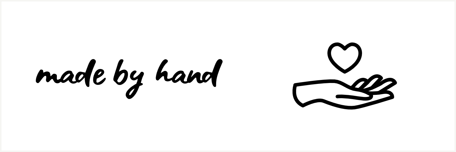
If you visit Made by Hand often, or follow me on social media, you may have noticed some minor changes to the look of the brand last week. I decided recently to update some of the branding assets in preparation for some really cool new projects. I’m still utilizing the same two logo marks: the handwritten name, as well as the hand and heart icon.

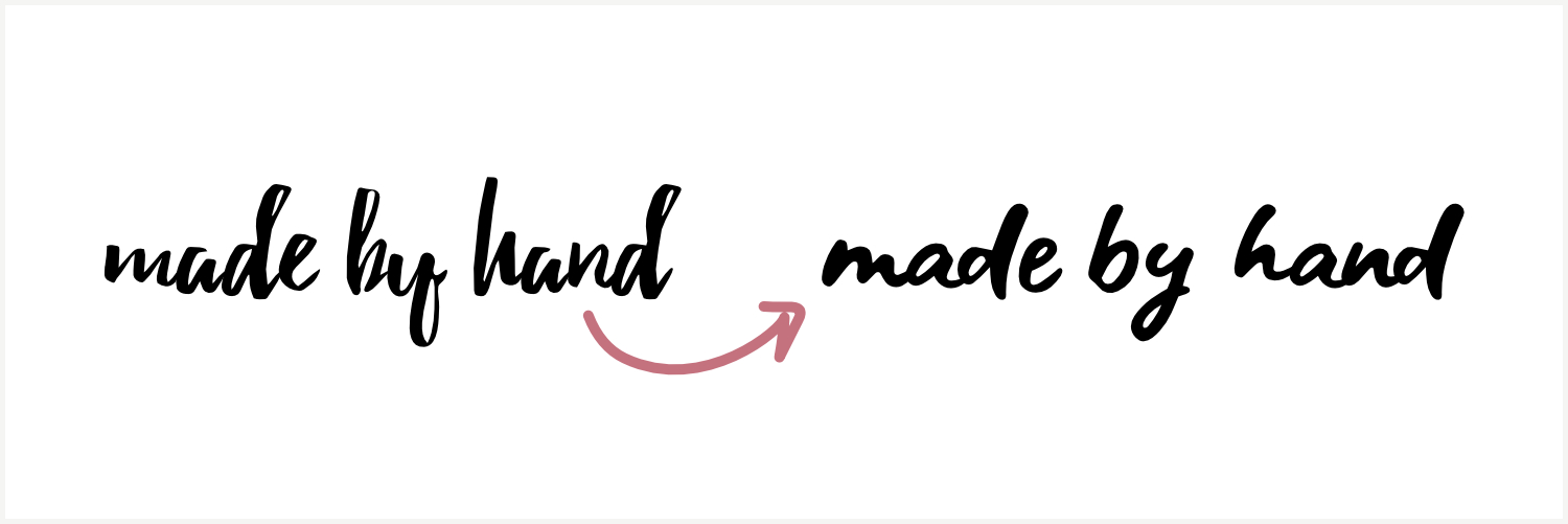
The handwritten text logo got a new font with a more fluid, soft look and feel. This is to accommodate some animation projects I have planned for the next few months! The old font I used was nice, but I had a hard time working with it for some of the effects I wanted to achieve, so I gave it a little refresh to help with that without changing the overall vibe of the MBH brand.

The hand and heart icon also got an update to something more modern and easy to decipher. The old icon was based on creating the hand and heart with a single line, but I was unable to use that idea to get the exact shape and look I wanted out of the symbol. This new icon is a lot more basic, but also sticks out more, and it more obvious what the subject matter is.
![]()
I’m really excited to be sharing these updates with you because I’m now offering graphic design services through Made by Hand! I want to help other makers and artists create the design elements they need to really make their business their own. No more fudging templates to be “good enough” for what you want. I’m here to help you bring any vision you have to life!
Check out my graphic design services to learn more and start your project today!


